EasyPost
shipping label creation flow design + usability testing
Reimagined a cumbersome and lengthy form experience into a positive moment of accessible delight, efficiency and flexibility.
View prototypeRole: Research, Design, Prototypes
Team: 1 Designer, 2 Engineers, 20+ participants
Timeline: 2 Months
Slide left/right for before | after
Problem
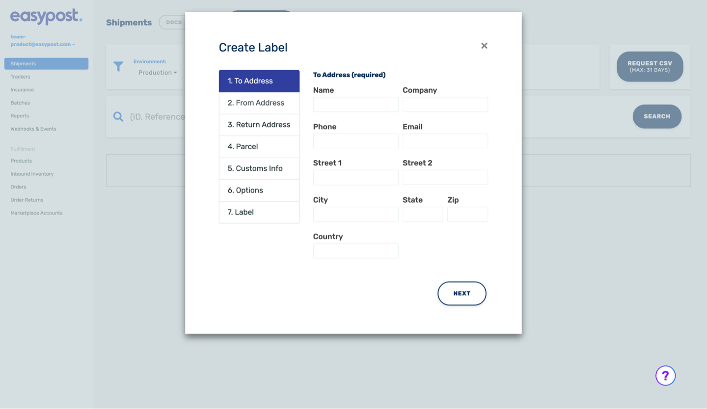
The original label creation process was inefficient and frustrating for users, with unclear workflows and unnecessary steps that slowed down task completion. Users struggled to complete shipping tasks quickly and accurately, creating friction and dissatisfaction.
Solution
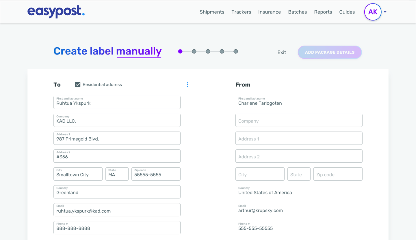
I conducted extensive usability testing focused on speed, legibility, and task completion rates to inform the design of a new label creation flow. The redesign included an optimized step-by-step process with autofill capabilities to reduce manual input, ensuring users could complete their tasks faster. The flow was also restructured with a logical order, making it easier to navigate and reducing cognitive load for users. Legibility and clarity were prioritized throughout to create a smoother, more intuitive experience.
Impact
The redesigned label creation flow dramatically improved efficiency and user satisfaction. By focusing on speed and accuracy through features like autofill and better task organization, users could complete their work more quickly and with greater confidence. This updated design not only enhanced productivity but also strengthened the overall user experience, making the tool a key asset for EasyPost’s shipping platform.
Vision
Consistency and continuity in the user experience by keeping content within the same context. Users can navigate between pages seamlessly without interruptions or distractions caused by modals.
Users should have a clearer sense of context because they can see the content surrounding the current page. This helps users maintain focus and understand the relationship between different pieces of information.
Improved accessibility to provide a clear structure and navigation flow. Users who rely on screen readers or keyboard navigation can more easily navigate between pages and understand the content hierarchy.
Enhanced mobile responsiveness: Page-based UIs can be more easily optimized for mobile devices, as designers can create responsive layouts that adapt to different screen sizes. This ensures that content remains readable and usable across various devices without sacrificing user experience.
Better support for browser features such as history, bookmarking, and back/forward navigation. This allows users to easily revisit previously viewed pages and bookmark important content for future reference.
Reduced cognitive load: Page-based UIs can help reduce cognitive load by presenting content in a structured manner. Users can focus on one task or piece of information at a time without being overwhelmed by additional layers of interaction introduced by modals.
In many cases, loading a new page is faster than loading a modal, especially if the modal contains complex content or functionality. This can contribute to a smoother and more responsive user experience.
Values
By prioritizing these values during the design process, I converted and created a UI with many steps and fields to just a few pages that effectively guided users through the process while providing a positive and intuitive experience.
Clarity: The UI should be clear and easy to understand, guiding users through each step with clear instructions and visual cues.
Consistency: Maintain consistency in design elements, layout, and navigation throughout the UI to reduce cognitive load and enhance usability.
Simplicity: Keep the UI simple and streamlined, avoiding unnecessary complexity or clutter that can overwhelm users.
Progress indication: Provide clear feedback on the user’s progress through the steps, such as progress bars, step indicators, or breadcrumbs.
Flexibility: Design the UI to accommodate different user preferences, devices, and screen sizes.
Feedback and validation: Provide immediate feedback when users interact with the UI.
Accessibility: Ensure that the UI is accessible to users with disabilities by following best practices for accessibility.
User testing and iteration: Conduct user testing throughout the design process to gather feedback and identify areas for improvement.
Methods
We used several methods to identify whether the modal or page design is performing well:
Usability Testing: Conducted usability testing with real users to observe their interactions with the designs.
Heatmaps and Click Tracking: Visualized user interactions with the design.
A/B Testing: Performed A/B testing by presenting different versions of the design to users and comparing their performance or behavior.
Analytics Data: Analyzed quantitative data from web analytics tools to track user behavior, engagement metrics, and conversion rates.
Customer Feedback and Support Tickets: Monitored customer feedback channels to gather insights into user satisfaction and identify recurring issues or pain points with the new design implementation.
Obstacles
Disruption of workflow: Modal interrupts the user’s workflow by overlaying content on the current page.
Loss of context: When a modal pops up, it often obscures the underlying content, leading to a loss of context.
Limited space: Modals have limited space, which can constrain the amount of information that can be displayed or the complexity of interactions that can occur within them.
Accessibility concerns: Modal can pose accessibility challenges, particularly for users who rely on screen readers or keyboard navigation.
Mobile responsiveness: Modal is not optimized for mobile devices, where screen real estate is limited.
Measures
We evaluated various aspects of the user experience and its impact on business goals:
Raise Task Success Rate and Speed up to 60%: Measured the percentage of users who successfully complete tasks and forms.
User Engagement Metrics: Tracked user engagement metrics such as time spent on the page, number of visits, page views, and interaction patterns.
Triple Retention and Lower Churn Rates by 40%: Measured user retention and churn rates to assess the long-term impact of the design on user loyalty and satisfaction.
Adherence to relevant standards of accessibility such as WCAG (Web Content Accessibility Guidelines).
Modal (Original)
Page (New)
Design Insights and User Feedback
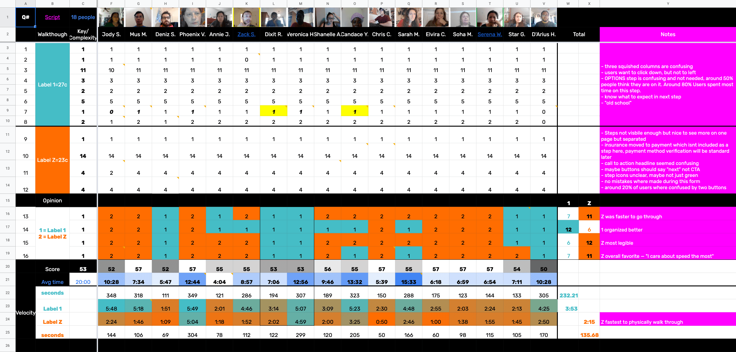
Usability Test Insights
The usability test focused on evaluating the label creation process, specifically how users navigated through options, selected details, and finalized label creation. Key areas included:
- Label Options and Input Fields: Ensuring users could easily select label options, enter details, and understand cost implications.
- Flow Efficiency: Assessing how quickly users could progress through label creation without confusion.
- Error Prevention and Resolution: Observing any errors and how easily users could correct them.
What Users Wanted
- Clearer Instructions: More guidance on specific steps, especially for infrequent users or those unfamiliar with terminology.
- Simplified Flow: Fewer steps for a quicker label creation process.
- Visibility of Key Information: Real-time display of cost, estimated delivery, and options without switching screens.
- Error Assistance: Clear prompts or corrections for common mistakes, preventing the need to backtrack.
Overall, users valued an intuitive and efficient label creation flow with minimal interruptions, visibility of essential information, and guidance on potential issues.