EasyPost fulfillment logged-in dashboard analytics MVP
Created the first round of the analytics dashboard based on persona needs and the limitations in the amount of data queryable at a given moment.
Role: Design, Prototypes, PM, ResearchTeam: 1-2 Designers, 3 Engineers, 2 Data Scientists,
1 Project Manager
Timeline: 1 month
Problem
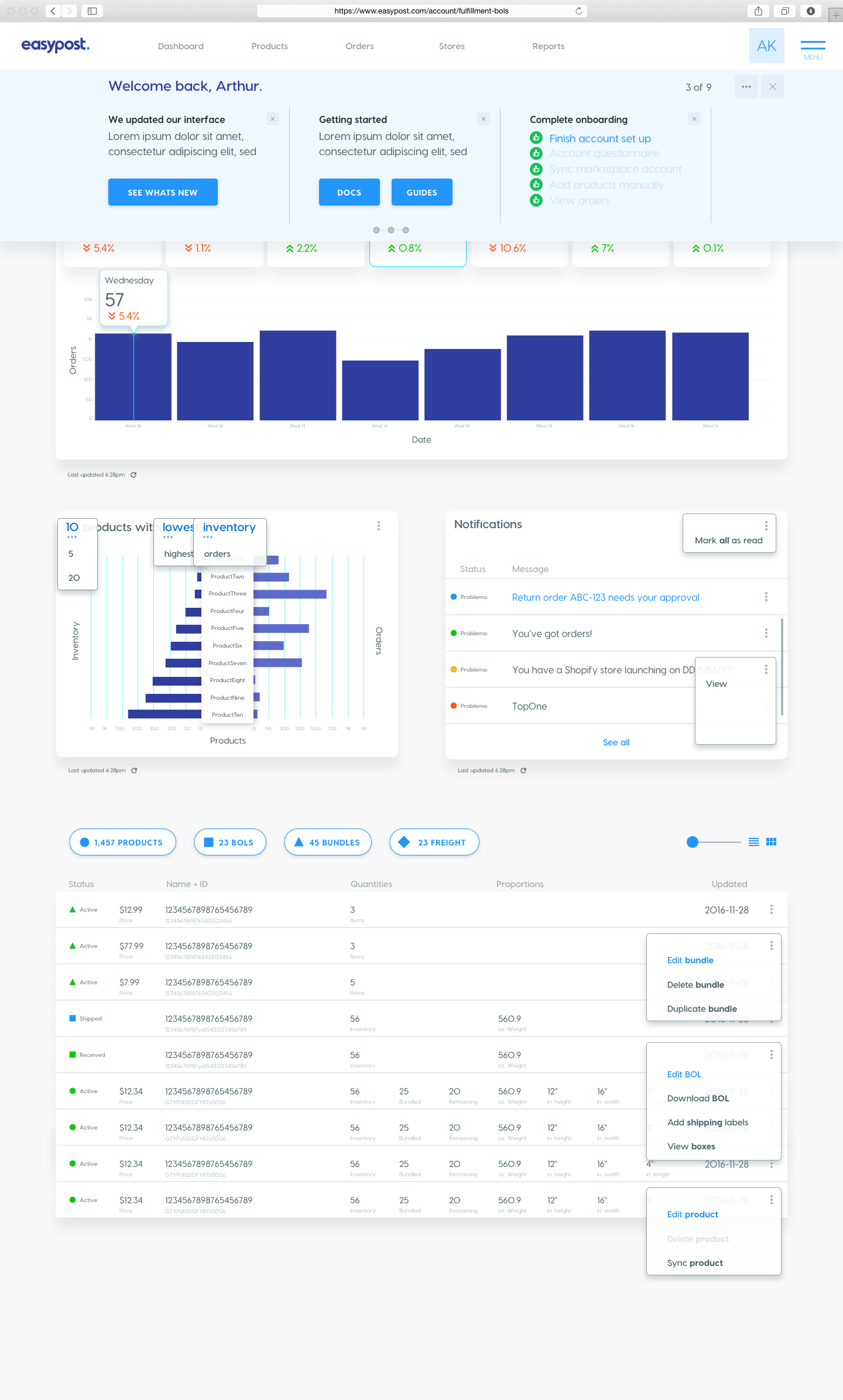
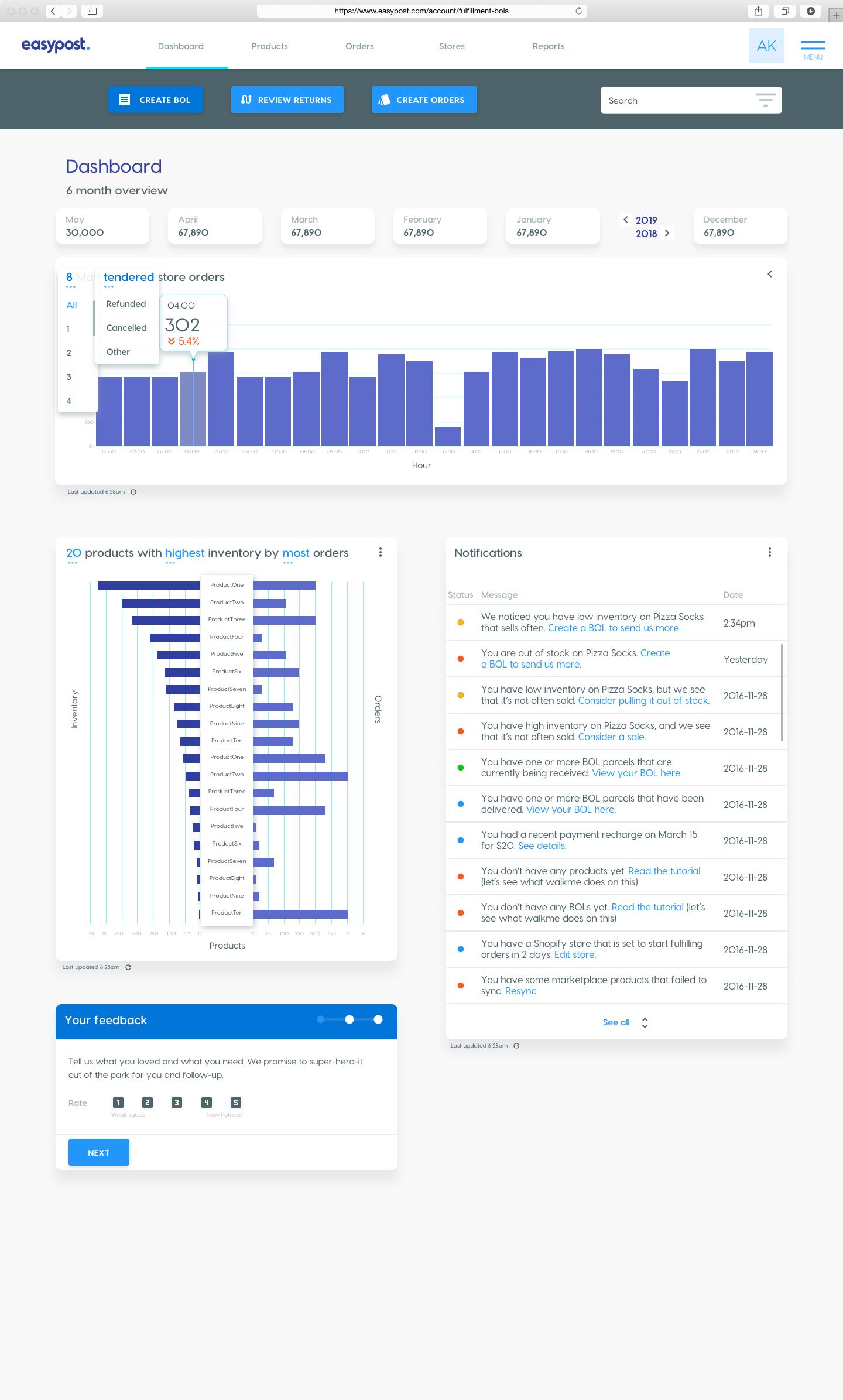
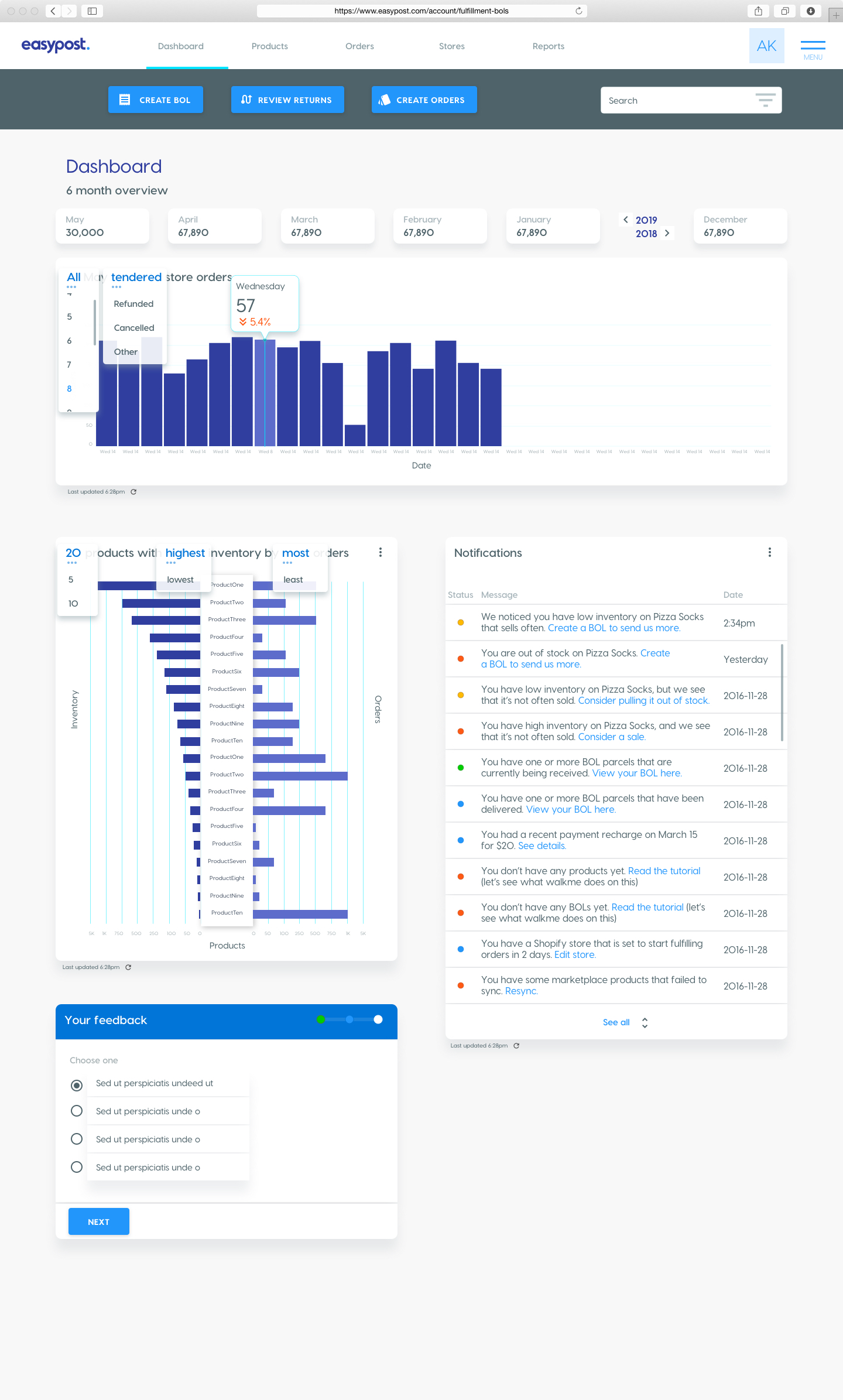
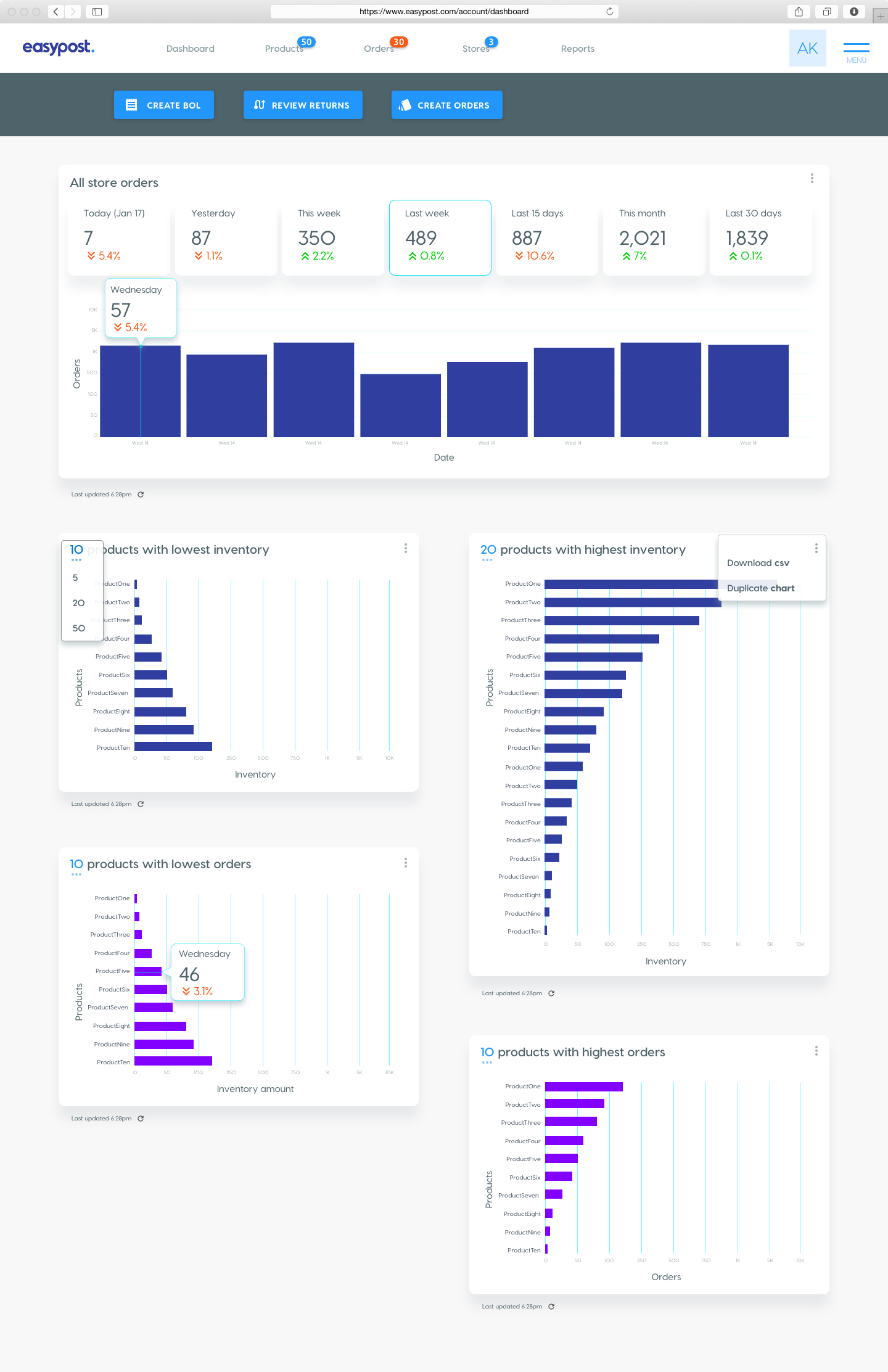
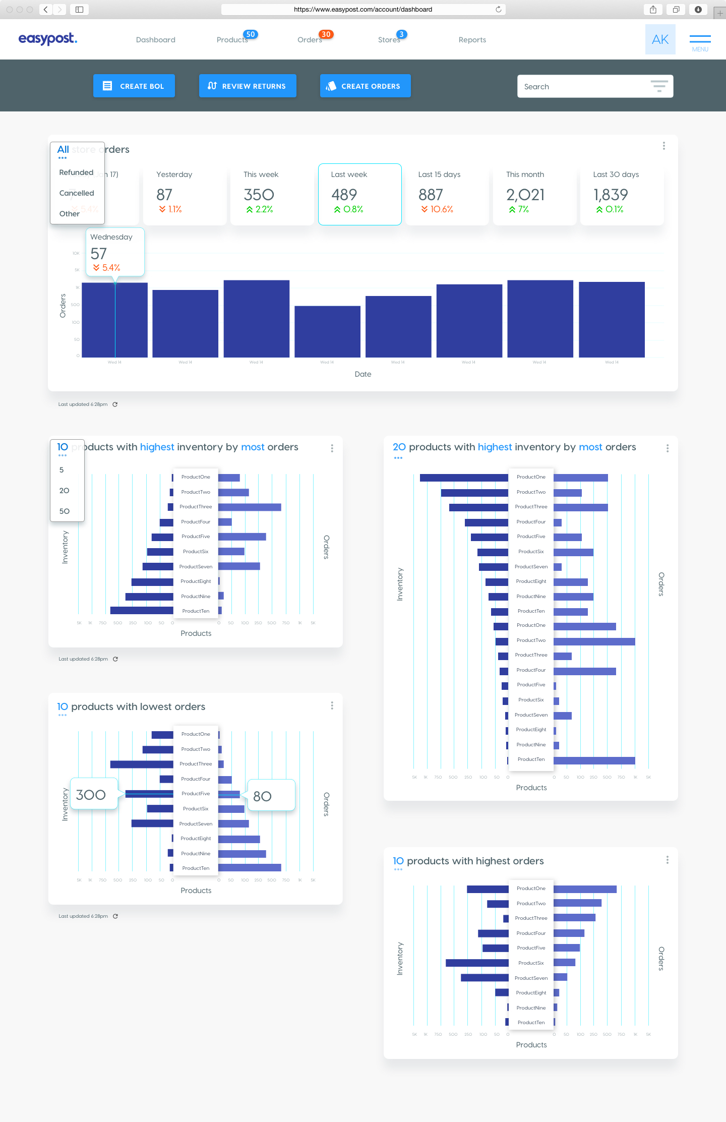
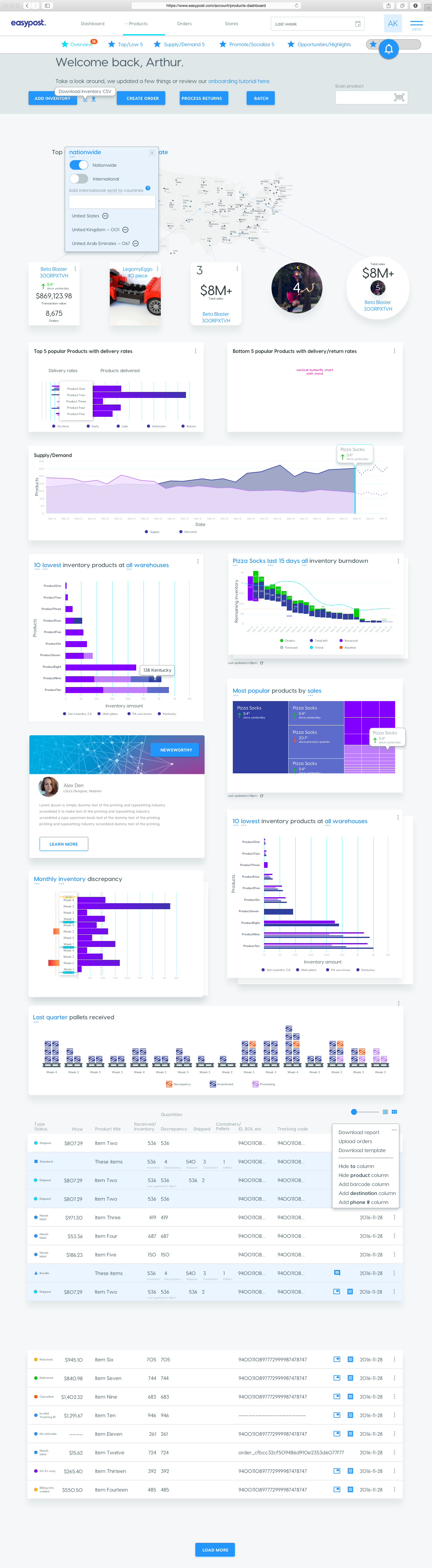
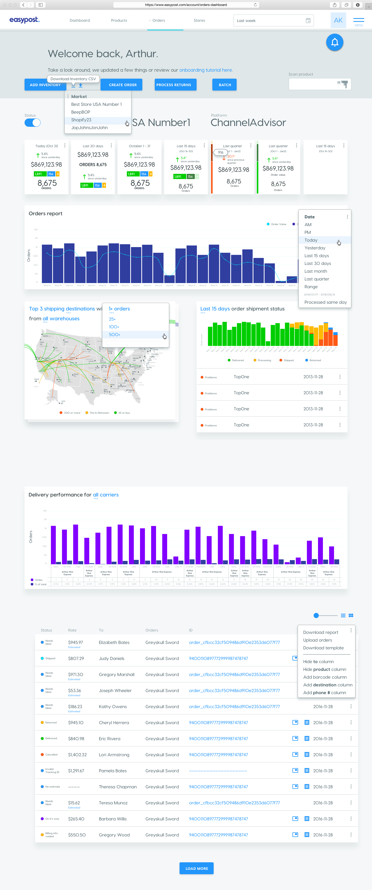
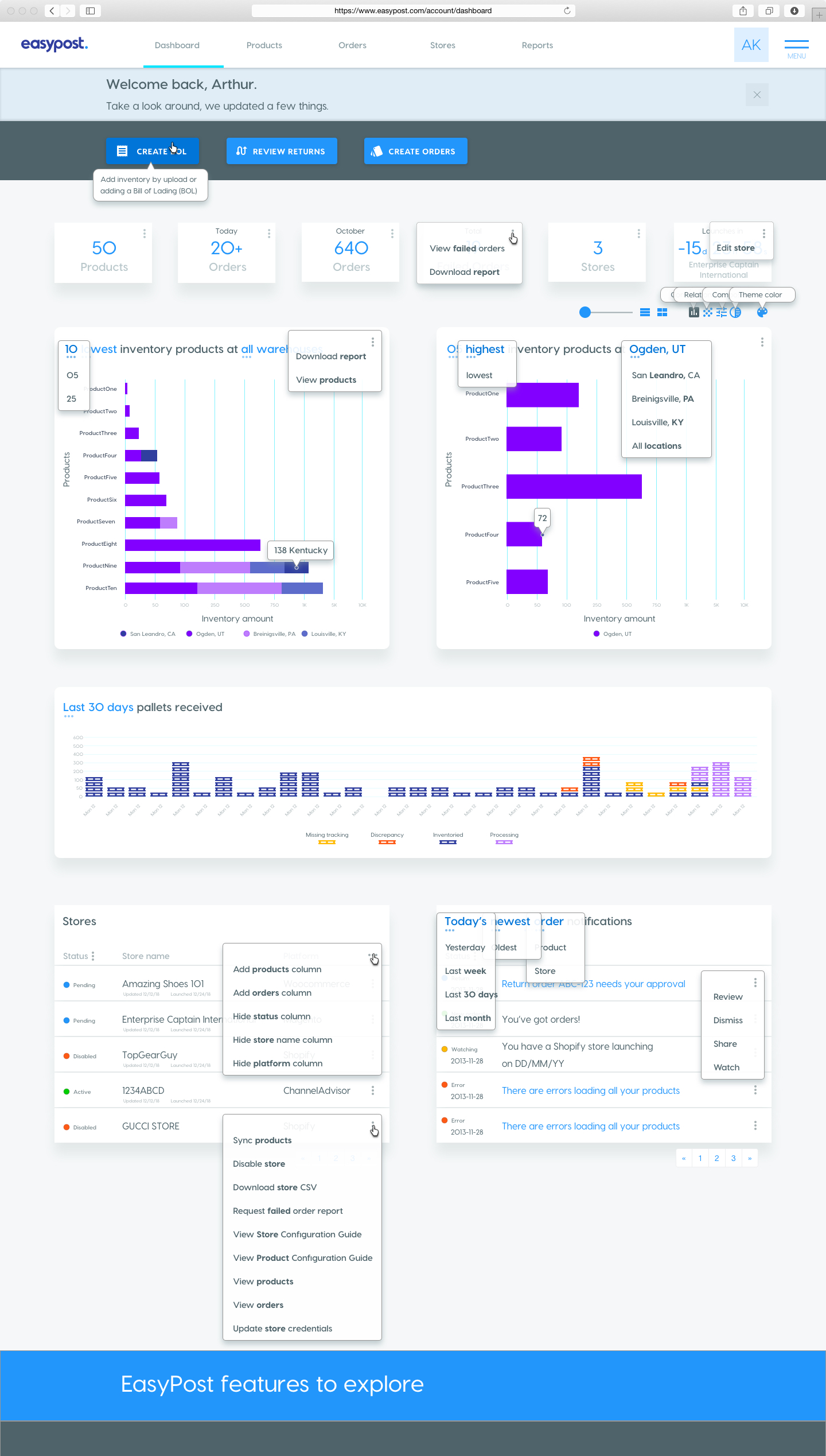
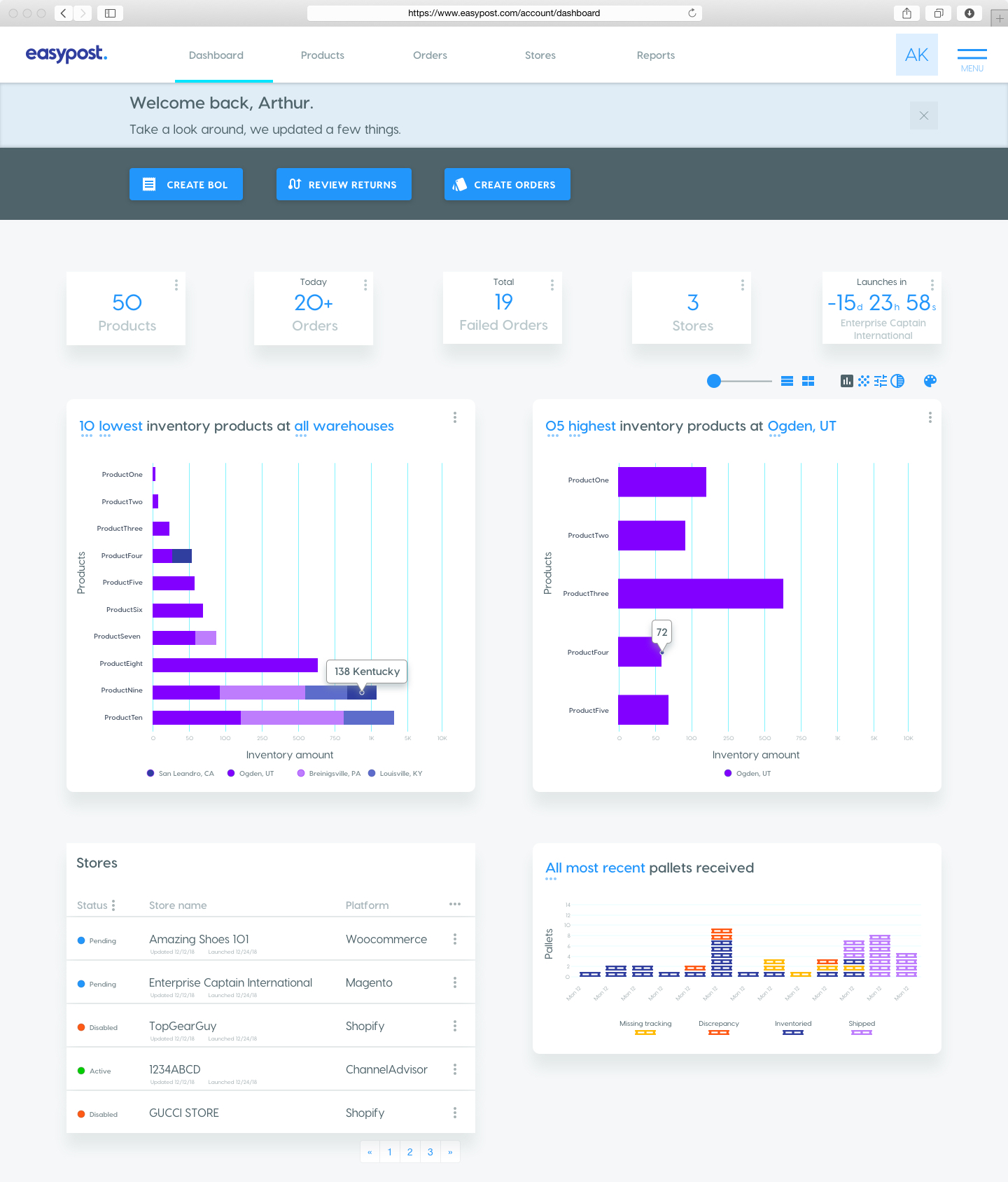
Users needed a comprehensive yet intuitive way to monitor fulfillment performance in real time. The existing dashboard was limited in its analytics capabilities, making it difficult to track shipment trends, operational efficiency, and financial data effectively.
Solution
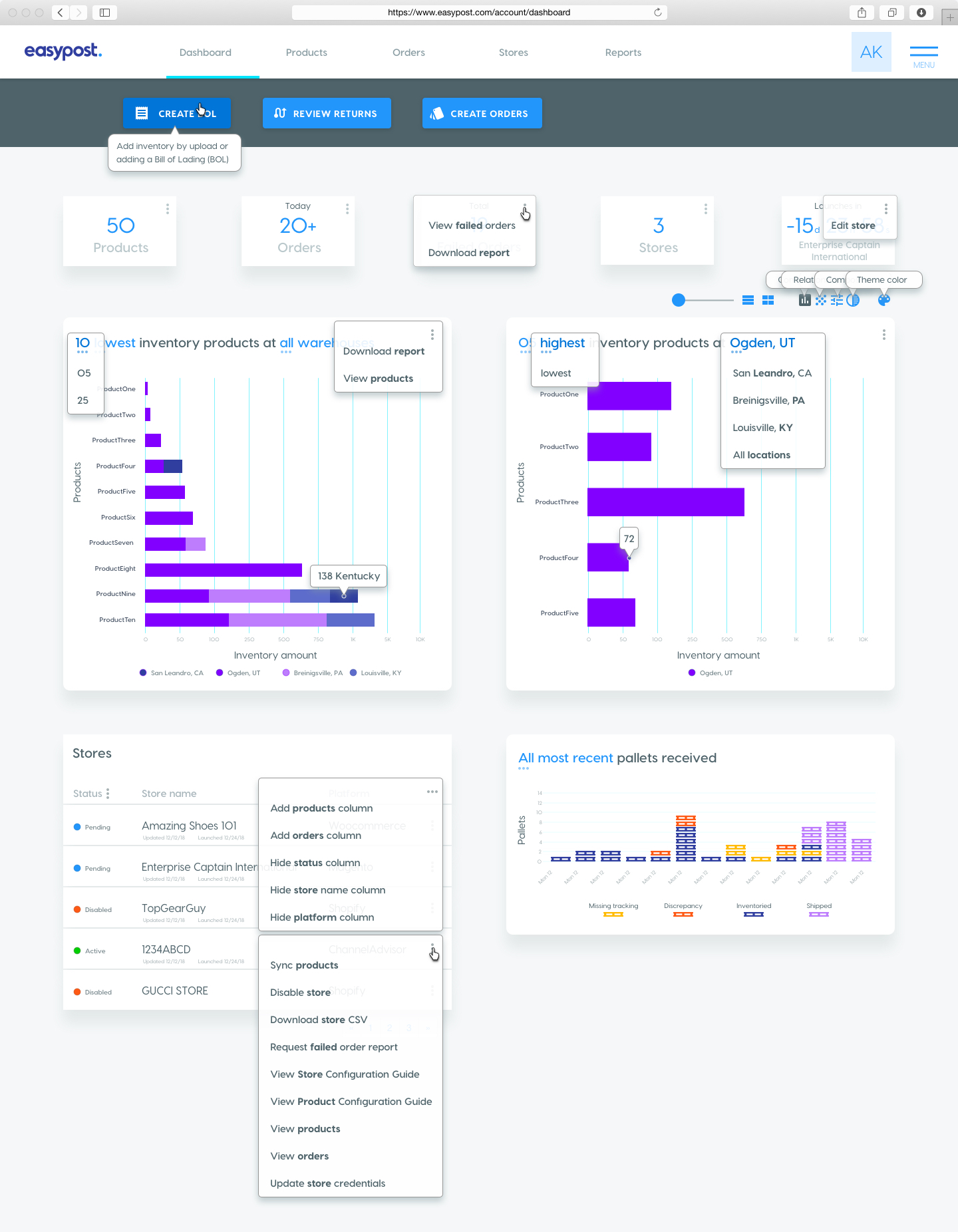
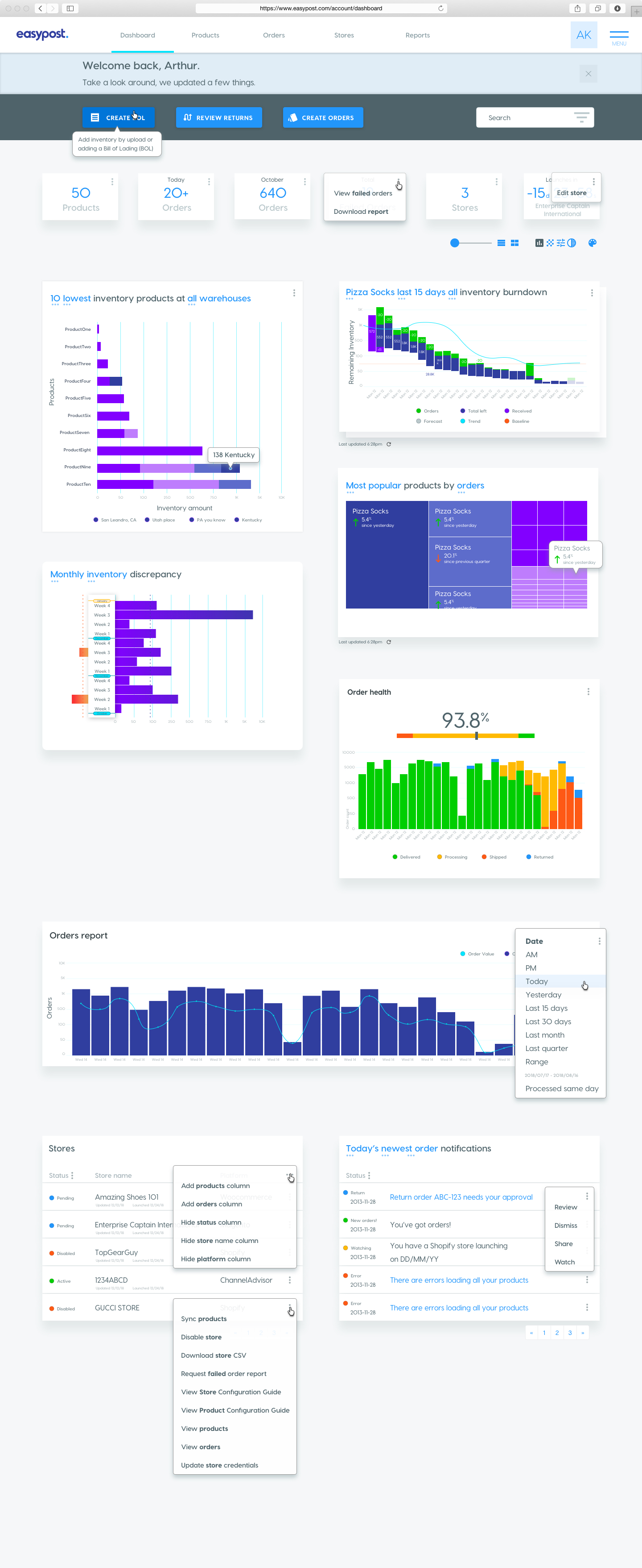
I designed a data-driven, user-friendly dashboard that provided key analytics at a glance. The new design featured interactive charts, shipment trends, and financial summaries, all displayed in a clean, hierarchical layout. Users could drill down into data with filters and visualizations tailored to their specific needs, offering both high-level overviews and granular insights.
Impact
The redesigned dashboard enhanced decision-making for fulfillment teams by making analytics actionable and accessible. Users reported improved workflow efficiency and greater confidence in monitoring operations. The tool became a vital asset for optimizing performance and reducing costs across all fulfillment processes.
Ideation
MVP