EasyPost logged-out
page experience redesign + concept validation testing
Role: Research, design, prototype
Team: 2-4 Designers, 1 Project Manager, 2 Developers, 1 QA
Timeline: 3 months
Problem
EasyPost’s logged-out pages were outdated and misaligned with the company’s evolving brand identity, leading to low engagement and poor user experiences. The lack of clear design direction and ineffective content structure made it difficult for visitors to understand EasyPost’s offerings and take desired actions, such as signing up.
Solution
As part of a broader rebrand, EasyPost redesigned its logged-out pages to align with a modernized visual identity and user expectations. The redesign process incorporated extensive user research and competitive analysis. In Design Round 1, three concepts were tested: photo-based, graphic/3D illustrations, and updated boxes. While the photo-based design was the most relatable, graphic/3D illustrations performed best in guiding users toward taking action. In Design Round 2, these insights were combined to refine designs, blending human elements with a modern, visually appealing aesthetic. The new designs emphasized clarity, accessibility, and brand consistency.
Impact
The updated pages, now cohesive with the company’s rebrand, significantly improved user engagement and streamlined the path toward key actions like signing up. The integration of relatable imagery and dynamic visuals enhanced trust and usability, helping EasyPost convey its value proposition more effectively. These improvements directly supported the company’s goals of increasing user acquisition and reinforcing its market presence through a refreshed, professional brand identity.
Grow and edit existing marketing methods
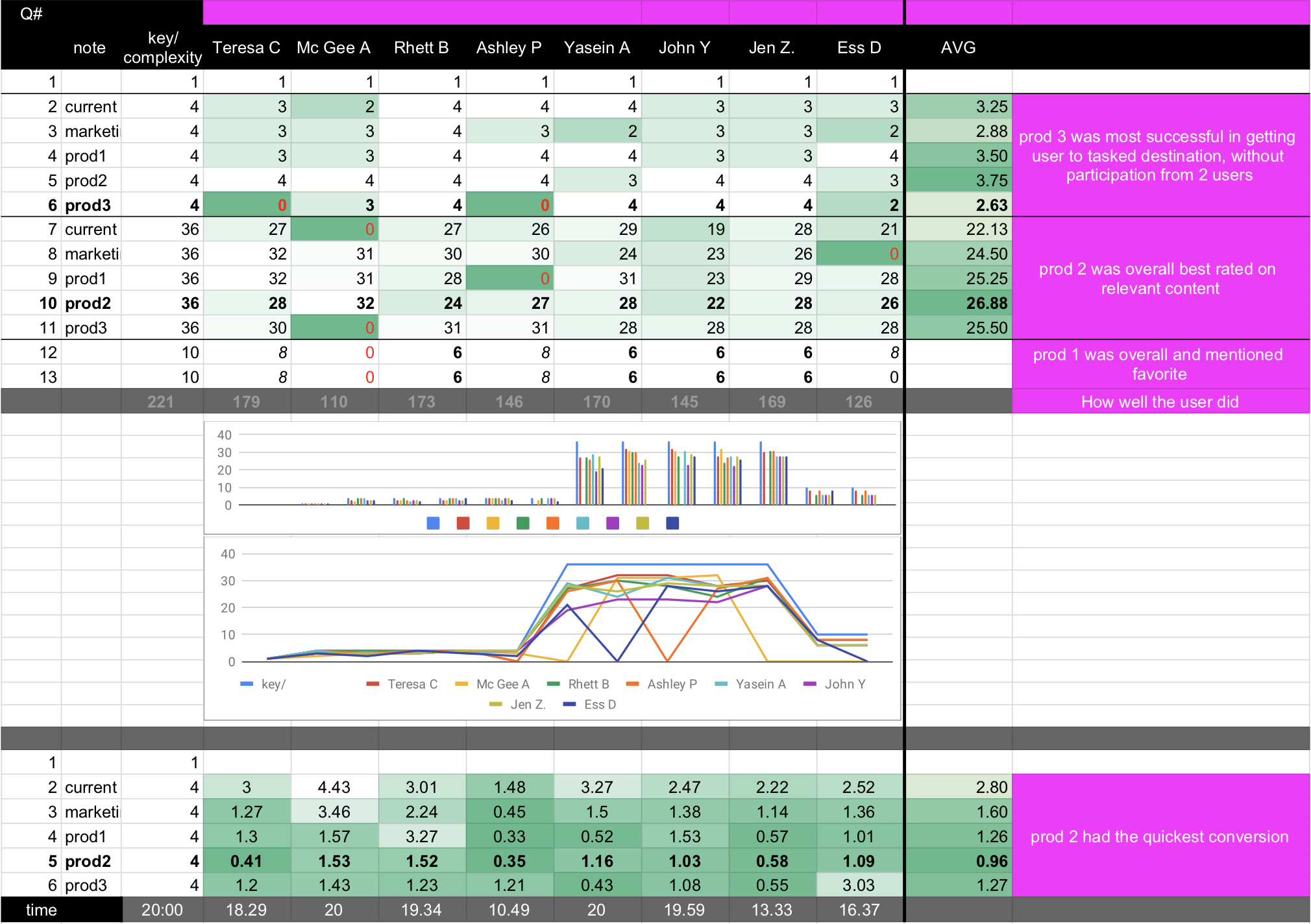
Design Round 1 + A Test Against Existing Design
3 new designs/concepts were tested against the marketing pages and existing pages. The current pages always did the worst, followed by marketing pages. The 3 additional concepts were:
- Photo/people based – Best overall and mentioned favorite. It didn’t win the top spots necessarily, but participants loved it.
- Graphic/3D illustrations – Overall best-rated based on relevant content. Illustrations also converted (sign up) the fastest. After internal discussion, we decided to pursue versions of this one.
- Updated boxes – Most successful in getting users to tasked destination, without participation from 2 users, but internally people didn’t like its simplicity.
Logged-out page usability test results
Design New Versions Based on Previous Results
Design Round 2
- Photo/people-based concept
- Graphic/3D illustrations
- Neon future style
In this second design phase, we developed three new concepts to improve visual engagement and usability, influenced by feedback from the first round. Our goal was to experiment with unique aesthetic elements and assess how well these variations resonated within internal reviews.
After presenting these concepts to the Product and Marketing teams, we found that the Graphic/3D illustration approach still performed best overall. However, based on our findings, we plan to integrate more human elements to enhance personal connection and user relatability.
Drawn Together Concept
Photo-Based Concept
Neon Future Concept
Next round of design
Design round 3
We continued to flush out graphic style with the people elements and different colors per requests from stakeholders. We tested info hierarchy, design satisfaction and overall favorite.
Sudden concept change
Design round 4
A story best left for an in-person conversation 😉