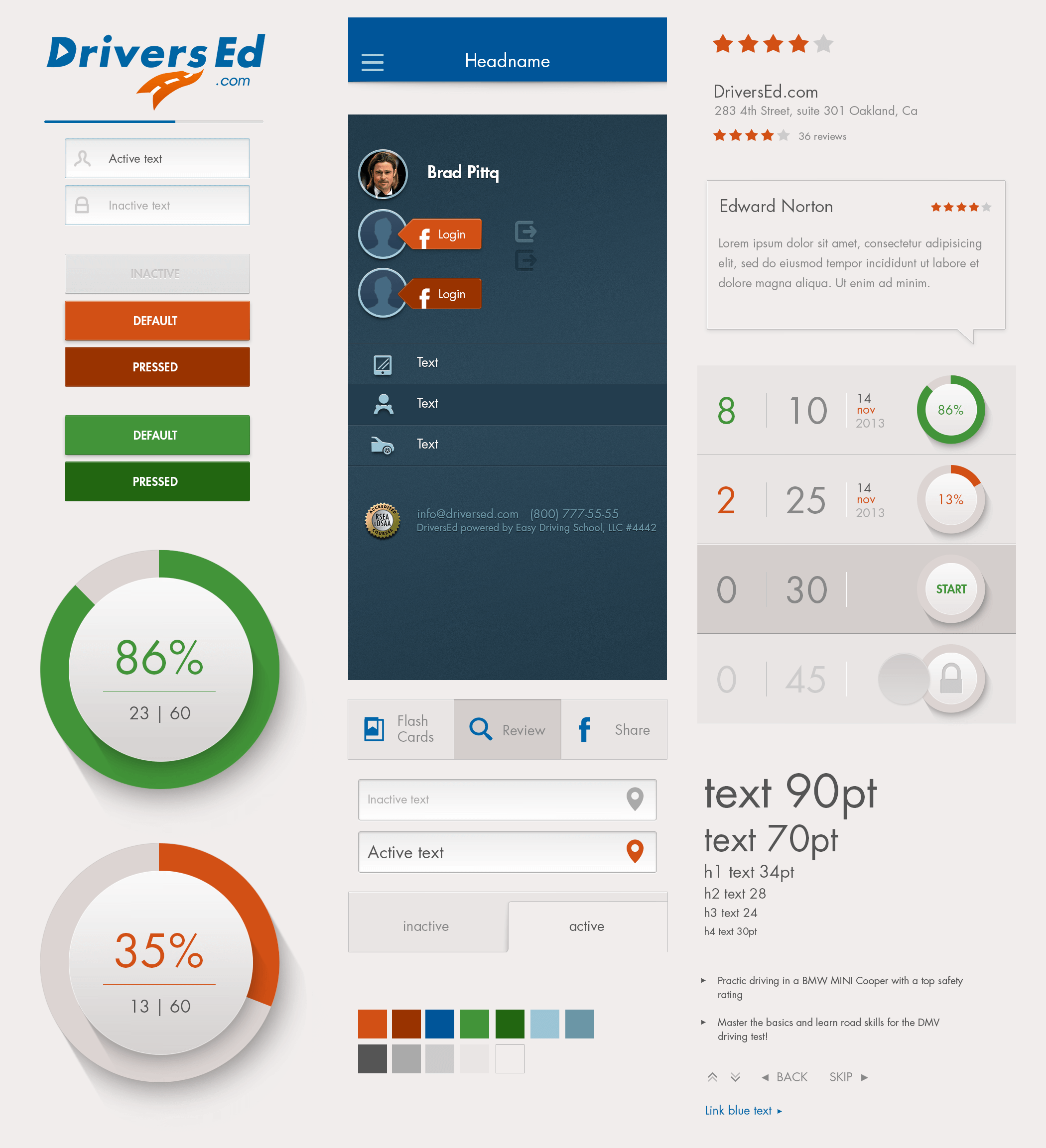
Nationwide drivers education app design system
Role: research, concepting, design, usabilty testing, management
Purpose & Vision: Tailored to California students, this iOS app focuses on making driver education accessible, state-approved, and engaging, suitable for mobile learning on both iPhones and iPads.
Color Palette
- Primary Colors: Bright greens (indicating progress or “correct”) and calming blues for guidance and safety.
- Secondary Colors: Yellow for cautions or reminders, with subtle grays for backgrounds to maintain clarity and focus.
Typography
- Primary Font: San Francisco, with bold headers for topic emphasis and regular body text for instructions and scenarios.
- Readability: Larger font options for accessibility, providing adjustable text sizes to suit learner preferences.
Icons & Imagery
- Themed Icons: Road signs, arrows, and car icons, keeping designs familiar and functional, reinforcing lessons.
- Illustrations: Clean, minimalist drawings of vehicles, lanes, and signs to reinforce key safety concepts.
Buttons & Interactive Elements
- Rounded Buttons: Color-coded for actions (“Start Quiz,” “Review Mistake”), ensuring ease of recognition.
- Feedback & Transitions: Tactile feedback and animations to simulate real-time responses, such as button shading on click, promoting active engagement.
Learning Modules
- Progress Tracker: Visual bars and “lesson completed” indicators for easy progress checking.
- Quizzes & Assessments: Interactive quizzes after each section, providing instant feedback with colors and encouraging review with a simple, non-distracting UI.