EasyPost
responsive table design
TEAM:1 Senior UX Designer | 1 Project Manager
| 1 Developer
Problem
Both small and medium-sized businesses (SMBs) and enterprise companies struggled with inefficient shipment tracking tools, leading to customer dissatisfaction and increased churn. For SMBs, limited resources made it challenging to track shipments effectively and provide timely updates to their customers. Enterprise companies, on the other hand, faced issues with scalability, managing high volumes of shipment data, and delivering a seamless tracking experience across multiple channels. These challenges hindered their ability to build trust and maintain long-term customer relationships.
Solution
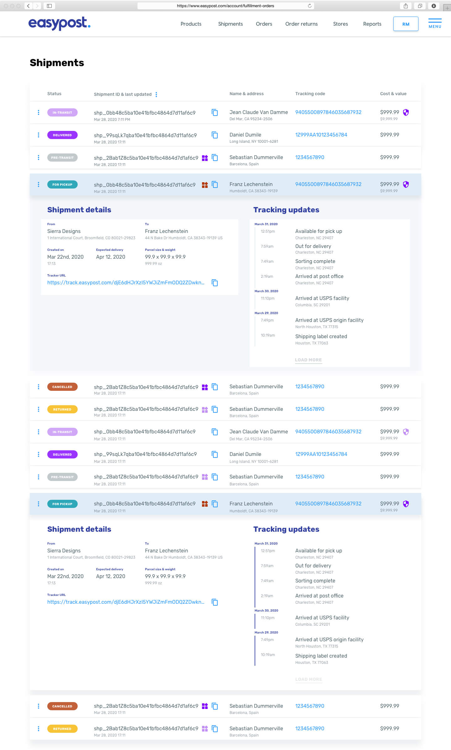
EasyPost introduced a redesigned shipment tracking system featuring responsive, intuitive tables that catered to the needs of both SMBs and enterprise clients. The solution prioritized accessibility and scalability, ensuring businesses of all sizes could manage shipment tracking effectively across devices. EasyPost’s design included clear hierarchies for shipment attributes like status, location, and delivery ETA, while also supporting large-scale data handling for enterprise clients. Additionally, the platform was built to integrate seamlessly with existing systems, minimizing the friction of adoption for larger organizations.
Impact
The redesigned tracking tools improved operational efficiency and customer satisfaction for businesses of all sizes. SMBs benefited from a streamlined, easy-to-use tracking experience that reduced manual effort and improved transparency for their customers. Enterprise companies were able to scale their shipment management processes, effectively handling high data volumes and enhancing customer communication. These improvements helped reduce customer churn by providing proactive updates and building trust. Overall, the new system positioned EasyPost as a reliable partner for organizations seeking to optimize their shipment tracking and customer retention strategies.
Research tool and users
Map out and group all attributes
Design table hierarchy
Test usability and legibility
Why Responsiveness Matters for Large Data Tables
- User Accessibility: A responsive table layout improves accessibility, allowing users on any device to view essential information without needing to scroll horizontally, zoom in, or rotate the screen.
- Usability: By maintaining legibility and ease of interaction across screen sizes, responsive tables prevent frustration, reduce bounce rates, and keep users engaged.
- Data-Driven Decision Making: Many users rely on data to make quick decisions. Responsive tables ensure that users can quickly access the data they need, even on mobile.
- Professionalism and Credibility: A well-designed, responsive table indicates attention to detail and enhances the perception of a site as modern, professional, and user-centered.
Benefits of Responsive Tables for Desktop, Mobile, and Tablet
- Consistent User Experience: Responsive tables ensure that users experience a consistent interface, keeping the data easy to view, compare, and interact with across all devices.
- Enhanced Engagement: By providing quick access to data on mobile and tablet, responsive tables keep users engaged longer, as they can efficiently interact with the data wherever they are.
- Accessibility: Responsive tables contribute to the mobile-friendliness of a site, potentially accesibility through WCAG and ADA compliance.
- Flexible Viewing Options: Users can switch between desktop, tablet, and mobile without sacrificing data accessibility, meaning they can access information at work, on the go, or at home.
Desktop
Tablet
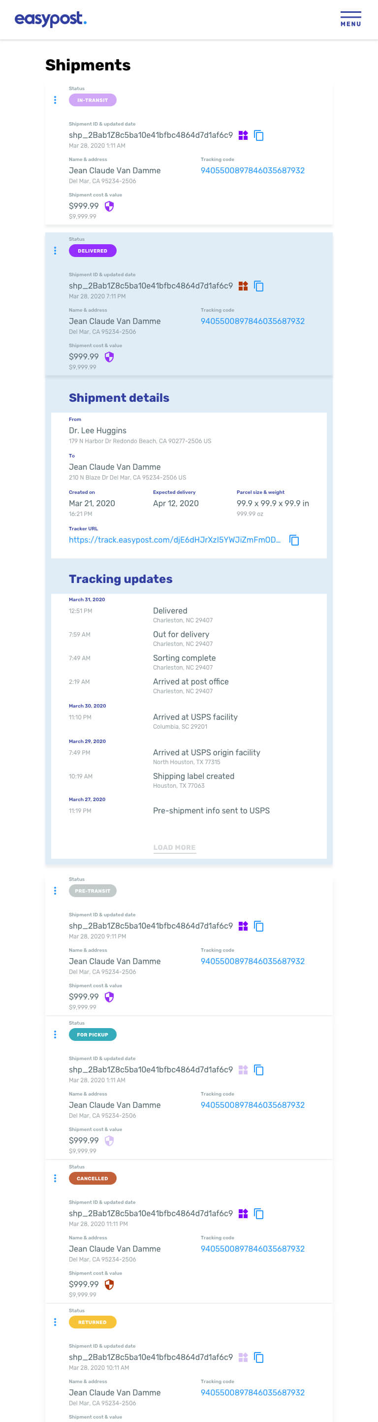
Mobile
